‘Norwegian Wood’ was my first foray into Murakami’s world. I was quite surprised to know that ‘Norwegian Wood’ was published in 1987 and I hardly knew of it for so long. I guess the fascination for an all-encompassing literature beyond the US-UK landscape is more recent.
I am not a music lover, and as for Western music, I know of nothing except maybe Taylor Swift. So, I had to wait for the pages to turn and divulge from where the book gets its title. Norwegian Wood is about Toru Watanabe’s story of finding love and meaning in life, with two female characters – Naoko and Midori against a background of the student movement in Tokyo. Naoko’s favourite song is Norwegian Wood. The original Japanese title of the book is ‘Noruwei no Mori’ translated as Norwegian Wood. Naoko’s character holds an important position in the book than that of Toru as her emotional instability shadows Toru’s life.
The wood in the Beatles’ song refers to ‘wood’ while in the book, it is more in the sense of ‘woods’ or ‘forests’. Forests indeed form an important imagery in the story with Naoko and Toru taking the long walks at the sanatorium.
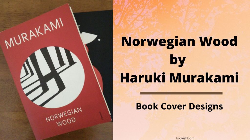
On my copy of the Norwegian Wood, the cover illustration is by Noma Bar and the design is by Suzanne Dean, the Creative Director at Penguin’s Vintage. This duo has created the iconic ‘black-white-red’ colour palette for dystopian genre under the Penguin’s Vintage book editions.

In an interview, Suzanne Dean had said that she came up with the concept of the symbolic circle for Murakami’s books in 2012 and this design has been a recurring feature on the covers ever since. Hence creating a series of visual metaphors on the book covers. Regarding the image on the cover of Norwegian Wood, Suzanne Dean said, “It’s Noma’s playfulness, and the fact there’s an image within the first image and maybe you take a little bit of time to see it, which works with Murakami’s playfulness”.
Within this white circle imposed on or cut out of the red background, black tree trunks are casting their shadows. You look a bit longer and the trees transform into the legs of three persons. To me, the one at the front is Naoko. The one that seems distant is Midori. And, the one turned to walk away is Toru casting a long shadow of his past. There is an intersection or a box-shaped black blotch; perhaps it is just a figurative way of creating ‘H’ for Haruki as the top only mentions Murakami.
On second thoughts, I feel that the two legs on the left of the cover are Toru and Naoko walking in the woods but their relationship is haunted by Kizuki’s long cast shadow on Toru. The shadow of the legs walking away from the two characters is casting its shadow on only one character. So it could be Naoko on the front. Understandably, the earlier book covers have sought to project Naoko’s picture on the cover. On a metaphorical level, the image could be different paths these characters take and their intersections as destined.

The Barnes and Nobel edition has the green marshy woods on the cover and aesthetics of white circles and straight plus dotted lines on the play.
You may also like a post on Norwegian Wood Book Review
The Japanese movie adaptation of ‘Norwegian Wood’ came out in 2010; based on the movie poster were the movie-tie-in book covers. I am not sure if there is an English dubbed version. And, because the poster has unfamiliar actors, I cannot connect with them on the book cover…sigh! (If you think there is an English dubbed version available then do let me know in the comments section :-))

In 1997, Vintage Books designer John Gall had created a universal look for all of Murakami’s paperbacks. To quote John Gall on the design for Norwegian Wood, ‘For Murakami’s most straightforward narrative I wanted a straightforward cover as well. Then, I focused on a woman’s face because it’s a love story, really, and added a sixties vibe.’

Thanks for being kind enough to read my posts, you can read through the series by clicking on the following links A, B, C, D, E, F, G, H, I , J, K, L, M

Pingback: Reviewing My First Haruki Murakami Novel: 'Norwegian Wood' - Bibliosini
Pingback: A Portrait of the Artist as a Young Man by James Joyce: A Letter to the Book Cover #A2Z Challenge – Bookishloom
Pingback: Buying a Fishing Rod for My Grandfather by Gao Xinjiang: A Letter to the Cover #A2Z challenge – Bookishloom
Pingback: The White Tiger by Aravind Adiga: A Letter to the Book Cover #A2Z Challenge – Bookishloom
Pingback: (Q) Don Quixote by Miguel de Cervantes: A letter to the book cover #A2Z challenge – Bookishloom
You definitely make it sound very interesting and I love your interpretation of what the first cover means. 🙂
LikeLiked by 1 person
Thank you so much, Shweta!
LikeLiked by 1 person
Pingback: Pigeon English by Stephen Kelman: A letter to the book cover #A2Z challenge – Bookishloom
I haven’t read Murakami yet. Have ordered one before lockdown, but it couldn’t be delivered.
This book is also in my wishlist. I really liked that it’s related to music because I am a music lover. And really loved the way you have explained the red cover. I hope I got to read it soon.
LikeLiked by 1 person
Hope you get the book delivered as soon as things get back to normal. I am really glad you liked the post! Thank you so much!
LikeLiked by 1 person
Pingback: The Old Man and The Sea by Ernest Hemingway: A Letter to the Book Cover #A2Z challenge – Bookishloom
Your description about the book is amazing. The two legs of the cover was that your analysis?
LikeLiked by 1 person
I am glad you liked the post. There was intuition and then I did a bit of research on how Vintage is working with the theme and colour palette on their covers. Thank you so much for stopping by.
LikeLiked by 1 person
Murakami is a hit or miss. Norwegian Wood was better. Covers with movie/series adaptation actors rarely work for me. They help the book sell more, no doubt.
LikeLiked by 1 person
I feel the same. Kafka on the Shore is next on my TBR, let’s see how it goes.
Thank you so much for visiting!
LikeLike
I dont know why I am so reluctant to pick up a Murakami. I havent read any of his books.
LikeLiked by 1 person
Even I am quite late to Murakami’s world. I have ‘Kafka on the Shore’ on my TBR but I keep putting it aside for something else. Hope you are able to read his books real soon.
Thank you so much for stopping by!
LikeLiked by 1 person
I’ve laways liked the Penguin book covers for Murakami’s books, but I never noticed all those subliminal messages. Loved you rinterpretations of the shadows.
@JazzFeathers
The Old Shelter – Living the Twenties
LikeLiked by 1 person
I agree Penguin book covers are always good. Am glad you liked the post.
Thank you so much for stopping by!
LikeLike
Your analysis of book covers are fascinating. It feels like a different area of study.
LikeLiked by 1 person
Thank you so much. I am glad you like the post!
LikeLike
I love this book! I’m going to go back and include it in my N book recommendations on my post too.
LikeLiked by 1 person
Thank you so much!
LikeLiked by 1 person
You have introduced the book so well and I love your letter to the cover. I liked both the book covers..although the Barnes and Noble version seems more intriguing 😊 to me. Am so interested in reading the book now. Thankyou for yet another brilliant write up.
LikeLiked by 1 person
Even I feel a bit more inclined towards the green marshy cover by Barnes and Noble.
I am really glad that you like my posts and thank you so much!
LikeLike
I find Murukarmi on days of turbulence. He’s not an easy author to stick to because some of his books are too abstract to get through. But easily one of the best authors to understand what great writing means
LikeLiked by 1 person
Murukami* auto correct messed it up.
LikeLiked by 1 person
I have only read this one so far. And, wasn’t as impressed…probably because I was constantly drawing parallels with The Catcher in the Rye.
I have ‘Kafka on the Shore’ next on my TBR so let’s see how that goes.
Thank you so much for stopping by!
LikeLike